Study notes
Load and clean data
# Load data from csv file
!wget https://raw.githubusercontent.com/MicrosoftDocs/mslearn-introduction-to-machine-learning/main/Data/ml-basics/grades.csv
df_students = pd.read_csv('grades.csv',delimiter=',',header='infer')
# Remove any rows with missing data
df_students = df_students.dropna(axis=0, how='any')
# Calculate who passed.
# Assuming 60 is the grade, all students with Grade >=60 get True, others False
passes = pd.Series(df_students['Grade'] >= 60)
# Add a new column Pass that contains passed value per every student, see above
df_students = pd.concat([df_students, passes.rename("Pass")], axis=1)
# dataframe
df_students
Name
Name
| # | Name | StudyHours | Grade | Pass |
|---|---|---|---|---|
| 0 | Dan | 10.00 | 50.0 | False |
| 1 | Joann | 11.50 | 50.0 | False |
| 2 | Pedro | 9.00 | 47.0 | False |
| 3 | Rosie | 16.00 | 97.0 | True |
| 4 | Ethan | 9.25 | 49.0 | False |
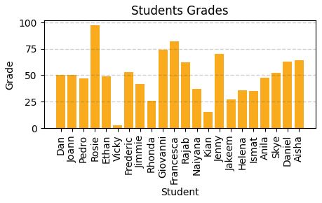
Visualise data with matplotlib
# Plots shown inline here
%matplotlib inline
from matplotlib import pyplot as plt
plt.figure(figsize=(12,5))
#create bar chart
plt.bar(x=df_students.Name, height=df_students.Grade)
# Title
plt.title('Students Grades')
plt.xlabel('Student')
plt.ylabel('Grade')
# Show y labels on vertical
plt.xticks(rotation=90)
# Show grid
plt.grid(color="#cccccc, linestyle='--', linewidth=2, axis='y', alpha=0.7)
#display it
plt.show()

# Compute how many students pass and how many fails
rez =df_students.Pass.value_counts()
print(rez)
False 15
True 7
Name: Pass, dtype: int64
Keys (index) False and True
They will be used in legend for pie chart bellow.
Figure with two subplots
%matplotlib inline
fig, ax = plt.subplots(1,2, figsize=(10,4))
# Create bar chart plot
ax[0].bar(x=df_students.Name, height=df_students.Grade, color='green')
ax[0].set_title('Grades')
ax[0].set_xticklabels(df_students.Name, rotation=90)
# Create pie chart plot
pass_count = df_students['Pass'].value_counts()
# Above can be pass_count=df_students.Pass.value_counts() caount haw many Pass and Not Pass are
ax[1].pie(pass_count, labels=pass_count)
ax[1].set_title('Passing Count')
# Build a list where label name is the key from pass_count dataset and the explanation si the value.
ax[1].legend(pass_count.keys().tolist())
#Ad subtitle to figure (with 2 subplots)
fig.suptitle('Student Data')
#Show
fig.show()
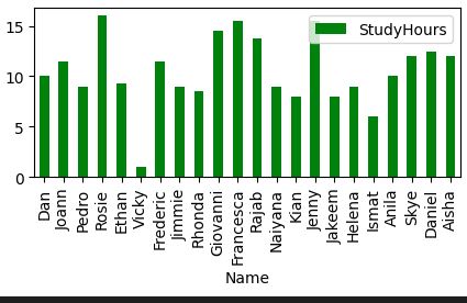
Pandas includes graphics capabilities.
# Automatic lables on y rotation, automatic legend generation
df_students.plot.bar(x='Name', y='StudyHours', color ='green', figsize=(5,2))
Descriptive statistics and data distribution
Read this first.
Grouped frequency distributions (cristinabrata.com)
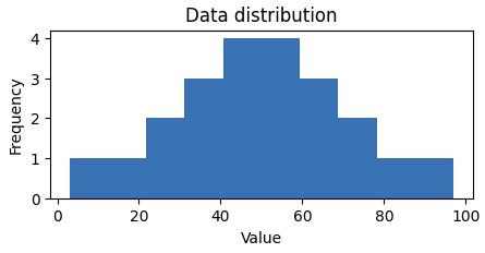
Q: How are Grades values distributed across the dataset (sample), not dataframe? Data distribution study unidimensional array in this case.
A: Create a histogram.
%matplotlib inline
from matplotlib import pyplot as plt
# Create data set
var_data = df_students.Grade
# Create and set figure size
fig = plt.figure(figsize=(5,2))
# Plot histogram
plt.hist(var_data)
# Text
plt.title('Data distribution')
plt.xlabel('Value')
plt.ylabel('Frequency')
fig.show()
 Looking to understand how values ae distributed, measure somehow to find the measure of central tendency (midle of distributin / data)
- mean(simple average)
- median(value in the middle)
- mode(most common occurring value)
%matplotlib inline
from matplotlib import pyplot as plt
# Var to examine
var = df_students['Grade']
# Statistics
min_val = var.min()
max_val = var.max()
mean_val = var.mean()
med_val = var.median()
mod_val = var.mode()[0]
print('Minimum:{:.2f}Mean:{:.2f}Median:{:.2f}Mode:{:.2f}Maximum:{:.2f}'.format(min_val, mean_val, med_val, mod_val, max_val))
# Set figure
fig = plt.figure(figsize=(5,2))
# Add lines
plt.axvline(x=min_val, color = 'gray', linestyle='dashed', linewidth=2)
plt.axvline(x=max_val, color = 'cyan', linestyle='dashed', linewidth=2)
plt.axvline(x=med_val, color = 'red', linestyle='dashed', linewidth=2)
plt.axvline(x=mod_val, color = 'yellow', linestyle='dashed', linewidth=2)
plt.axvline(x=max_val, color = 'gray', linestyle='dashed', linewidth=2)
# Text
# Add titles and labels
plt.title('Data Distribution')
plt.xlabel('Value')
plt.ylabel('Frequency')
# Show
fig.show()
Result:
Minimum:3.00
Mean:49.18
Median:49.50
Mode:50.00
Maximum:97.00
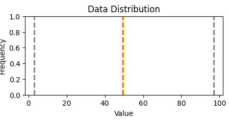
Two quartiles of the data reside: ~ 36 and 63, ie. 0-36 and 63-100
Grades are between 36 and 63.
As a summary: distribution and plot box in the same figure
Another way to visualize the distribution of a variable is to use a box plot (box-and-whiskers plot)
var = df_students['Grade']
fig = plt.figure(figsize=(5,2))
plt.boxplot(var)
plt.title('Data distribution')
fig.show()
fig = plt.figure(figsize=(5,2))
plt.boxplot(var)
plt.title('Data distribution')
fig.show()
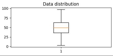
It is diferent from Histogram.
Show that 50% of dataresides - in 2 quartiles (between 36% abn 63%), the other 50% of data are between 0 - 36% and 63% -10%
Most common approach to have at a glance all is to build Histogram and Boxplot in the same figure.
# Create a function show_distribution
def show_distribution(var_data):
from matplotlib import pyplot as plt
min_val = var_data.min()
max_val = var_data.max()
mean_val = var_data.mean()
med_val = var_data.median()
mod_val = var_data.mode()[0]
fig, ax = plt.subplots(2, 1, figsize = (5,3))
# Plot histogram
ax[0].hist(var_data)
ax[0].set_ylabel('Frequency')
#Draw vertical lines
ax[0].axvline(x=min_val, color = 'gray', linestyle='dashed', linewidth = 2)
ax[0].axvline(x=mean_val, color = 'cyan', linestyle='dashed', linewidth = 2)
ax[0].axvline(x=med_val, color = 'red', linestyle='dashed', linewidth = 2)
ax[0].axvline(x=mod_val, color = 'yellow', linestyle='dashed', linewidth = 2)
ax[0].axvline(x=max_val, color = 'gray', linestyle='dashed', linewidth = 2)
#Plot the boxplot
ax[1].boxplot(var_data, vert=False)
ax[1].set_xlabel('Value')
fig.suptitle('Data Distribution')
fig.show()
col = df_students['Grade']
#Call function
show_distribution(col)
Minimum:3.00
Mean:49.18
Median:49.50
Mode:50.00
Maximum:97.00
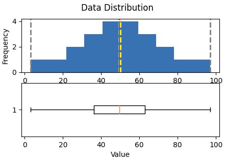 Central tendencyare right in the middle of the data distribution, which is symmetric with values becoming progressively lower in both directions from the middle
The Probability Density Functionis well implemented in pyplot
# Make sure you have scipy.
# How to install
# pip install scipy (run this in CS Code terminal
def show_density(var_data):
from matplotlib import pyplot as plt
fig = plt.figure(figsize=(10,4))
# Plot density
var_data.plot.density()
# Add titles and labels
plt.title('Data Density')
# Show the mean, median, and mode
plt.axvline(x=var_data.mean(), color = 'cyan', linestyle='dashed', linewidth = 2)
plt.axvline(x=var_data.median(), color = 'red', linestyle='dashed', linewidth = 2)
plt.axvline(x=var_data.mode()[0], color = 'yellow', linestyle='dashed', linewidth = 2)
# Show the figure
plt.show()
# Get the density of Grade
col = df_students['Grade']
show_density(col)
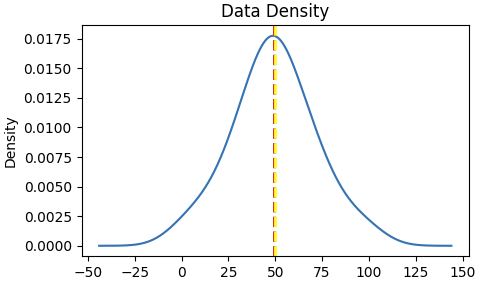
The density shows the characteristic "bell curve" of what statisticians call a normal distribution with the mean and mode at the center and symmetric tails.
References:
Exam DP-100: Designing and Implementing a Data Science Solution on Azure - Certifications | Microsoft Learn
Welcome to Python.org
pandas - Python Data Analysis Library (pydata.org)
Matplotlib — Visualization with Python0